 A landing page is made to get your visitor to do something specific. Everything about a landing page is meant to persuade the visitor to a desired action.
Know the Purpose
What do you want your visitor’s to do?
The purpose of your landing page could be to sell a product or service, get emails or subscribers, or sign up trial users. Find one goal and one goal only.
Whatever your goal is, make it straightforward. No sales pitch. No gimmicks. No confusion. Everything on the landing page is designed to entice visitors toward this goal.
Ask yourself: What’s the purpose, what am I offering, and how will they benefit?
Create Copy that Converts
Use a headline and possible subheads that are consistent with your goal.
Give your visitors a clear headline with a solution to a specific problem. People are usually in research mode when they are looking for something online. Show them the benefit to selecting you in a few words.
Write in second person using you and your.
Showcase your product or service to get visitors to empathize with a real-life scenario where they’re using what you’re offering. By focusing on visitors and not your product using the words you and your, you are helping them to envision what they will get out of the deal, increasing the perceived value of your offer.
Call to action – tell your visitors what they need to do.
Don’t use general call to actions like download now, submit, or click here. Be specific and include exactly what clicking on the graphic button will do for your visitor
The call to action should jump out from the landing page. It’s okay to include it more than once, especially if there is more scroll-down content. Add another CTA button beneath the layer of content “below the fold.”
Design for Simplicity
Less is more when your objective is singular.
Minimize all visual elements on the landing page. Eliminate anything that doesn’t support the desired action. Your landing page is very different from your home page.
No cutesy photos, no extraneous graphics, nothing that will distract the visitor from the goal. Think wide open space.
Use one column of text. Any additional columns should be placed to the side and used only as support for the objective. This could include testimonials, endorsements, client lists,
Include a hero shot.
The hero shot is the visual that sums up your offer at a glance. It can be a photo, diagram, chart, or graphic that captures your visitors’ attention and keeps their focus on the goal.
The hero shot can also help to create the real-life scenario that induces a feeling of what it would be like to use what you’re offering.
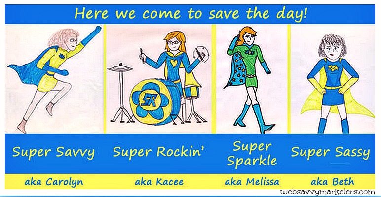
Speaking of heroes, check out Web Savvy Marketers’ own super heroes for website design and marketing. We make it fun, all extraordinary powers included.
Many landing pages feature one large photo with a bare minimum of text. Videos provide visitors a passive engagement medium, so don’t dismiss them as an option, particularly as the popularity of Vine and Instagram continue to grow.
For the Visitors Who Opt Out
Adding social media invite buttons give your visitors a back up to selecting your offer. Other back-up plans include giving something away or including a remind me later option where visitors can receive a reminder via email at a future date of their choosing.
Re-Build as Necessary
If it isn’t performing, change it. Improve a landing page that’s not working in your marketing plan.
“Landing pages are the new direct marketing, and everyone with a website is a direct marketer.” Seth Godin
If You Build It, They Will Come.
Build momentum toward one clear goal for your visitors, and they will come to your landing page with a clear expectation of what they will get from you.