Web Savvy Marketers

  • About
  • Services
    • Strategic Planning
    • Marketing Programs
    • Full-Service Web Design and Development
    • Content Marketing
  • Industry
  • Portfolio
  • Blog
    • Tools & Tips
      • Google Tips
      • Internet Scams
      • Motivational
      • Tips for a good website
      • Website Writing Tips
    • Marketing
      • Internet Marketing 101
      • Philanthropy
      • Search Engine Optimization (SEO)
      • Social Media
      • Web design/Internet Marketing
    • Web Design
      • E-commerce
      • Website Maintenance
  • Contact Us

Why Color Matters In Your Marketing Decisions

May 28, 2014 Beth Devine

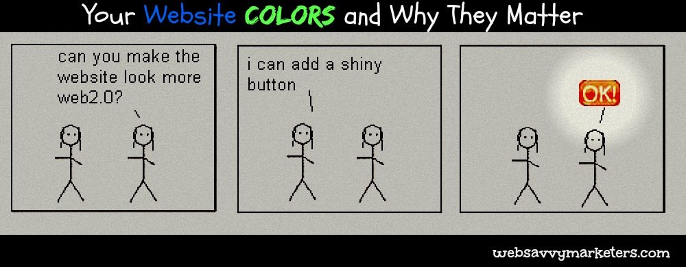
Why color mattersThis image is a derivative of web 2.0 by tyger_lyllie, licensed under CC BY.

What matters most when you make a marketing decision? Science shows that the visual has more impact on people than any of our other senses.

While the visuals of design, power words, and your main image all influence online behavior, your marketing decisions on color matters in how you are perceived.

What are the messages you are sending with your website colors? Are you taking advantage of the full effect of colors? A well-chosen color scheme can give your brand a unique message and convey the right emotions.

Want to know what colors mean to you compared to over 30,000 other responses? Take the color survey to find out.

Color is a key factor in brand recognition

Some of the most recognizable brands rely on color. Check out the power of color on this website and see how well you can identify brands by viewing a small section of their logo.

As this recognizable brand test demonstrates, brand recognition is often color dependent. Recognition can increase by up to 80% through the use of color, according to a much-touted University of Loyola, Maryland study.

Not only that, but brands are growing increasingly color-centric in their identity. Consider the red signature sole of Louboutin. Louboutin filed a trademark infringement claim against Yves Saint Laurent, who dared to use the red sole in their shoes that Louboutin claimed was their visual identity.

Louboutin was unsuccessful in this case, but others have been able to register a color as a trademark. Here’s a link for a list of currently registered trademarks.

Color increases memory

Studies show that pictures with natural colors, or “living colors” are more appealing and are more easily remembered than black and white. Compared to the colors of nature, falsely colored scenes did not improve memory.

“Perhaps designers should be aware that, in order to engage or grab one’s attention (as in advertising), bright colors might well be most suitable,” Felix A. Wichmann said, author of “The Contributions of Color to Recognition Memory for Natural Scenes.”

“If, on the other hand, the aim is more to have an image ‘stick’ in the viewer’s memory, unnatural colors may not be suitable.”

Color has meaning

Color has significant and unique meaning based on cultural, historical, and natural elements. Our perceptions of a color are based on how we have experienced it.

Red is seen as signaling danger, anger, and love. As the color of blood and fire, it was also extremely hard to come by. Ironically, much of the dye used to make red still comes from the cochineal beetle.

Red is one of the top two favorite colors, and is in three-quarters of the world’s flags. All languages have a word for black and white, with red the next color to exist.

The color green is now also a verb. It is intrinsically linked to nature, rebirth, and ecology. There are more shades of green than any other color.

Green is used to describe our moods. If you are nauseated, you are green around the gills. When you’re jealous, you’re green with envy, and when you’re green behind the ears, you are showing your immaturity.

Blue rates as the favorite color for all people. It’s the most common color in corporate branding and is associated with peace, denim, and trust.

It is also the $80 million color that Bing chose for its call-to-action links, making it a similarly colored blue to Google’s shade of blue.

Blue has its share of expressions, including blue laws, blue bloods, blue streak, blue book, and true blue. Without blue and all its varied meanings, we would most assuredly be singing the blues.

The colors of various brands can tell us a lot about what they wished to convey, as this chart shows:

Color Emotion Guide

Explore more visuals like this one.

Color choice can impact participation

The button color test has long been a way to see what color influences participation. What they found out might surprise you.

The colors red and green were selected. Red, as we’ve seen, connotes passion, and it is associated with “stop” as well as warning. Green, on the other hand, generally means “go” and points to nature and the environment. It is also the color most used for buttons on websites.

The test showed the red button won over the green button by 21%. While you shouldn’t go out and change your button colors, it’s not a bad idea to test your button colors with your audience and your website to see what the results are.

Color and gender preference

The True Colors survey says that blue ranks #1 for both males and females. Purple doesn’t rank at all with males, but it’s the second favorite color for females.

For least favorite colors, the genders are more similar, with both choosing brown and orange, although in different ranking order.

“Men keep it simple” couldn’t be more accurate. Woman give more names to color variants, allowing for grape, plum, or eggplant for purple, while men like to call purple by its name, not some fruit. (Yes, eggplant is a fruit.)

Men are also more likely to be color blind. Approximately 1 in 12 men and 1 in 20 women are affected by color blindness.

Color blindness is a color vision deficiency that is most common in a red/green deficiency. This means that people will mix up all colors that have some red or green as part of the whole color. For example, a color blind person will be unable to see the difference between blue and purple.

Vischeck simulates what color blind vision is, as well as offers a way to correct images for color blind viewers.

Choose your colors with this information in mind so you can show your true colors with confidence.

Filed Under: Kacee's Posts, Marketing, Tips for a good website, Web Design

How to Build a Landing Page

August 19, 2013 Beth Devine

how to build a landing pageA landing page is made to get your visitor to do something specific. Everything about a landing page is meant to persuade the visitor to a desired action.

Know the Purpose

What do you want your visitor’s to do?

The purpose of your landing page could be to sell a product or service, get emails or subscribers, or sign up trial users. Find one goal and one goal only.

Whatever your goal is, make it straightforward. No sales pitch. No gimmicks. No confusion. Everything on the landing page is designed to entice visitors toward this goal.

Ask yourself: What’s the purpose, what am I offering, and how will they benefit?

Create Copy that Converts

Use a headline and possible subheads that are consistent with your goal.

Give your visitors a clear headline with a solution to a specific problem. People are usually in research mode when they are looking for something online. Show them the benefit to selecting you in a few words.

Write in second person using you and your.

Showcase your product or service to get visitors to empathize with a real-life scenario where they’re using what you’re offering. By focusing on visitors and not your product using the words you and your, you are helping them to envision what they will get out of the deal, increasing the perceived value of your offer.

Call to action – tell your visitors what they need to do.

Don’t use general call to actions like download now, submit, or click here. Be specific and include exactly what clicking on the graphic button will do for your visitor

The call to action should jump out from the landing page. It’s okay to include it more than once, especially if there is more scroll-down content. Add another CTA button beneath the layer of content “below the fold.”

Design for Simplicity

Less is more when your objective is singular.

Minimize all visual elements on the landing page. Eliminate anything that doesn’t support the desired action. Your landing page is very different from your home page.

No cutesy photos, no extraneous graphics, nothing that will distract the visitor from the goal. Think wide open space.

Use one column of text. Any additional columns should be placed to the side and used only as support for the objective. This could include testimonials, endorsements, client lists,

Include a hero shot.

The hero shot is the visual that sums up your offer at a glance. It can be a photo, diagram, chart, or graphic that captures your visitors’ attention and keeps their focus on the goal.

The hero shot can also help to create the real-life scenario that induces a feeling of what it would be like to use what you’re offering.

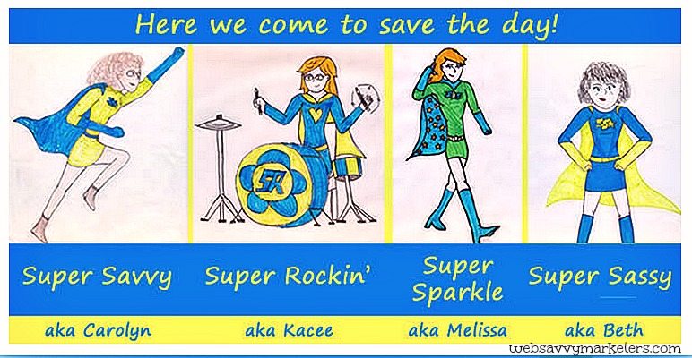
Speaking of heroes, check out Web Savvy Marketers’ own super heroes for website design and marketing. We make it fun, all extraordinary powers included.

Many landing pages feature one large photo with a bare minimum of text. Videos provide visitors a passive engagement medium, so don’t dismiss them as an option, particularly as the popularity of Vine and Instagram continue to grow.

For the Visitors Who Opt Out

Adding social media invite buttons give your visitors a back up to selecting your offer. Other back-up plans include giving something away or including a remind me later option where visitors can receive a reminder via email at a future date of their choosing.

Re-Build as Necessary

If it isn’t performing, change it. Improve a landing page that’s not working in your marketing plan.

“Landing pages are the new direct marketing, and everyone with a website is a direct marketer.” Seth Godin

If You Build It, They Will Come.

Build momentum toward one clear goal for your visitors, and they will come to your landing page with a clear expectation of what they will get from you.

Filed Under: Kacee's Posts, Tips for a good website, Tools & Tips, Web Design

A path for your 2013 web design

March 2, 2013 Carolyn Griswold

Web Design Trends Infographic
Infographic
by Trifunk


I love this infographic. It could be the outline for an initial web design consultation with new clients.

Knowing how hard it can be to extract content from some clients, this line cracked me up: “Are you sure? There must be a story in there somewhere. ” 

The original blog post that went along with it has some fun samples of current trends. I particularly enjoyed the parallax scrolling examples. Even if you don’t know or care about “parallax scrolling”  you’ll love playing with the 007 cars presentation, and Jess & Russ’ engagement timeline drew me in to their romance even though I was just there to see the technique.

Have some fun…check out the parallax scrolling at

  • Suave example: James Bond 007 Cars Evolution
  • Romantic example: Jess & Russ.


Filed Under: Tips for a good website, Tools & Tips, Web Design

Web Designer Seeking Instant Gratification

September 2, 2010 Carolyn Griswold

I’ve always liked building and making things. I like taking the parts and putting them together to make a nice package. I like crafts, cooking and puzzles. Completing a Sudoku puzzle on a Sunday morning is oddly satisfying.

But I’m not real patient. I like projects that can be completed quickly. That’s why I love building small business websites. It’s fun to take the pieces, the bits of text and graphics, and create a unique, functional and beautiful website for a small business.

In my perfect world, web design projects turn around quickly. Clients give me content, ideas and graphics. I create a draft website. They review and approve. And I press the button to make it live. Everybody’s happy!

Admittedly, it’s not always that easy. There is usually a little more give and take during the review process. I don’t always nail it on the first try. But even when the review process seems to drag on…eventually, finally, it’s oddly satisfying to press the button to make the site live. At that moment…there is instant gratification.

Filed Under: Web Design

A 9-year old website that still works

June 21, 2010 Carolyn Griswold

Screenshot of JanetsPlan-its.comI was on the phone with my client Janet Booth today and she asked me if her website was still listed on my portfolio page.

“It’s kind of old to be listed in my portfolio,” I said.

“What are you ashamed of it?” she said.

“No, actually it still looks pretty good,” I said.  “I’ll have to put it back on the site.”

The conversation got me thinking about why this website is still working.  After all it was designed in 2001, which, in human years is only nine years ago, but in website years is probably equivalent to about 90 years.  Coding standards have changed, design preferences have changed, browser and equipment choices have changed and user’s expectations have changed in nine years. Heck, even I’ve changed. I’d like to think I’m more skilled now than I was in 2001.  But this website is still doing the job.  Why?

Over the years we’ve added a shopping cart and we’ve updated the menus, but other than those two upgrades, the design hasn’t changed much.

I think the main reason why this site continues to work well is Janet.  She’s a proactive website owner.  She has, over the years, continued to build upon that initial website by consistently adding content and tweaking the site.  She works hard to give her clientele a useful website filled with content that’s informative, current and relevant.

She understands that content is what makes a website successful.  The design, while important,  is really only there to support and present the content.

So congratulations Janet for building a great website and for having the vision in 2001 to know what you wanted and for staying true to your vision.  And thank you for being a fun client and working with me for the past nine years.

More about JanetsPlan-its.com.

Filed Under: Tips for a good website, Web Design

Top ten considerations for web design

June 4, 2010 Carolyn Griswold

This week, I saw a LinkedIn discussion that asked “What do you think are top 10 considerations for web design?”

Interesting question.  The first response I saw said “usability, usability, usability”. I agree with this response…but I think there are at least 10 things that make a site usable, usable, usable.  So I’ll try to focus my list on what makes your site visitors want to use, use, and use your site again.

1. Beauty.

First your site has to be beautiful, or at least look professional, because if it’s not, people will leave it before you have a chance to show them all the other elements that make your site worthy of their time.

2. Navigation.

It must have logical navigation that is easy for users to follow.  You must lead them through your site; help them find the nugget of information they seek, by providing clear, simple navigation.

3. Well-written content.

Never underestimate the power of a well-written phrase to draw people in, to coax them to delve deeper.  Follow that phrase with clearly written content that’s organized and written to be understood by your site visitors.  Write first for your visitors, not for your cronies or for search bots.

4. Match content to design.

Use the content to help define the design. A serious subject should look serious.  A fun product should have a fun website.

5. Composition.

Use a writing style that is conducive to online viewing, scanning and reading.  Use short paragraphs with headings, bullets and graphics to draw the eye easily to specific ideas.  And give the user’s eyes a break with a healthy dose of white space.

6. Demographics.

Know your market.  Choose your colors, your styles, and your language depending on who will visit your site. Are they old, young, adventurous or sedate?  Are they likely to be using a ten-year old home computer or the latest smartphone  or IPad to browse your site?   Use  typography, color and design that will appeal to your users.

7. Style commitment.

Define  your styles and stick with ’em. Maintain a cohesive design.  Whether you use a jazzy heading font with a high contrast color scheme or a traditional type with monochromatic scheme.  Commit to it.

8.  Accessibility.

Don’t discriminate.  Make your site usable to all folks, bots and beings.   Although it’s not always necessary to comply with  Section 508 standards, it’s a good idea to understand what your web pages will sound like using a screen reader.   And it’s wise to use text that the user can size to their preference — even if it does make your site design look a little funky.   Validate your code so you won’t trip up miscellaneous bots, browsers and other beings who might be perusing the web.

9. Optimize for search engines.

Use best practices for SEO.  Write code that doesn’t obstruct or deter the searchbots.  Write unique and relevant keyword rich titles and headings for each and every page.

10. Create a call to action.

Understand the goal of the website.  Is it to sell? To inform? To communicate?  Define the goal and then make it easy and safe for people to complete that task.

Filed Under: Tips for a good website, Web Design, Web design/Internet Marketing

Three web design mistakes that can hurt SEO

May 12, 2010 Carolyn Griswold

You just started your business.  Your marketing budget is limited and you know you need a website, so you opt to use one of the many low-cost tools available to build your own website or you have your  daughter, (son, nephew or sister-in-law, name the friend or relative) who “knows the computer” do it for you.   You work your way through this uncharted territory and you manage to get your website up and running and it even looks pretty good.

Job well done! But as time passes,  you begin to wonder why it doesn’t rank better on the search engines.  Many techniques factor into good search engine optimization (SEO) but novice website designers or do-it-yourself business owners often make three big mistakes that can hurt their SEO.

  1. Search engines can’t read an image.  Overuse of images. If you have website pages that are made up entirely of images or if you have blocks of text that are made of images you’re preventing search engines from reading the text on your pages. If search engines can’t read your page, they don’t know how to index your page. I usually see this mistake made by those with some graphic design experience.  They may know how to create a beautiful layout but they haven’t learned the HTML/CSS code to transition that layout to the web correctly so they opt to insert the image into the web page instead of taking the time to code the page correctly.
  2. Search engines can’t read an image – the sequel.  Underuse of image alt tags. Each image used in a web page should use a descriptive alt tag. If alt tags are not used, search engines are not able to discern what the image signifies, so they ignore it. For example, say you’re Joe and you sell bicycles.  You’ve  created a fantastic logo that clearly identifies you as Joe’s Bicycle Sales & Service. You put it on you web pages and it looks beautiful but you fail to use the alt tag.  Now when search engines crawl your site they’re not able to discern what the logo says.  However, if you have used the alt tag correctly, the search engines will read the alt tag that says “Joe’s Bicycle Sales & Service” and because you’ve provided that information, the search engine will have more information available to index your website.If you’re building your website using a do-it-yourself tool, you should see a field called alt or image description in the tool.   If you’re coding, you’re image code should look something like this:

    <img src=”logo.jpg” alt=”Joe’s Bicycle Sales and Service” />

  3. If you wrote a book you, would you title it “Book”?  Title tags and meta descriptions not used at all or used ineffectively. Just like a book or magazine article, every web page should have a unique title. In addition each web page should also have a unique meta description that accurately describes the content on that page — think of the meta description as the book synopsis often found on back or inside jacket of the book. In an html document both the <title> and <meta description> tags are within the <head> of the document which, as you might expect since it’s called the head, is toward the top of the document.  So when search engines crawl the page the title and meta description tags are among the first indexable information they come across and search engines expect the tags to describe the content on the page because that is what the tags were designed to do.

    But too often, inexperienced or lazy web designers use a title tag like “home” instead of “Joe’s Bicycle Sales | Yourtown, Your state”. Or on the page that shows products the title tag says something like “products” instead of “Bicycles – Raleigh, Schwinn, Trek, bikes for all ages”.  And the meta descriptions are either ignored entirely and left blank, or the same generic information is duplicated on each page.

    The title tag is the information the web browser shows at the very top of the browser screen–above the toolbar and url address field.  You generally want to limit your title descriptions to less than 60 characters. The meta description tag is not viewable on a web page (unless you view source) but search engines sometimes use the meta description you provide on your html page as the description in your search engine listing.  Limit your meta descriptions to about 160 characters.

So if you’re not satisfied with your search engine rank, check to make sure that you haven’t overused images in your design; that you have described all your images with alt tags and that you’ve written unique title and meta descriptions for each page on your website.

Filed Under: Search Engine Optimization (SEO), Web Design, Web design/Internet Marketing, Website Maintenance

What are common sense internet solutions?

March 8, 2010 Carolyn Griswold

Let’s break it down. Merriam-Webster defines “common sense” as “sound and prudent judgment based on a simple perception of the situation or facts”.

We also find reference to the pamphlet Common Sense written  by Thomas Paine during revolutionary times.   Paine’s Common Sense made a straightforward argument for colonial independence that common folks understood. The plain-spoken pamphlet was widely read and is likely to have influenced the course of American history.

Given the definition of common sense, what are common sense internet solutions? If you define “solution” as being a problem solved, you could conclude that “common sense internet solutions’ translates to “a straightforward, sound and prudent course to solve your internet problems“.

Whoa! We can’t solve all the problems of the internet! But what we can do is solve your internet problems as it relates to your website.  So if your website is not performing as expected, we can help diagnose the problems and take steps to improve it’s performance.

How do we do that? Let’s break it down.

The problem: Your website is not performing as expected.   Perhaps you’d like to see…

  1. increased traffic and exposure
  2. increased sales
  3. increased leads
  4. better branding

Once your expectations are clear, we can take specific steps to solve your problem(s).  First we would look at your website.

  1. Is the website customer friendly? Is it well-designed? Will it appeal to your target market?  Does it look professional?  Is the content well-written and organized for on-screen viewing?  Can the average person find the information they need quickly when visiting your website?
  2. Is the website current?  Does it have relevant updated information? Does it provide a way for customers to communicate with you? Is it inviting?
  3. Is the website technically sound?  Does it comply with current coding standards?  Do all links, forms, carts, pages work the way they’re supposed to?

Once the website is user-friendly and polished, we look at how to spread the word.

  1. Is the site coded for search engine optimization?  Does it have well-written keyword title and descriptions tags?  Does the content include keyword rich headings?
  2. Are you tracking traffic?  Are you using a good statistics program like Google Analytics to analyze and review your website traffic?
  3. Are you or should you use social networking sites like LinkedIn, Facebook, YouTube or Twitter to help spread your message?
  4. Would an e-newsletter or e-promotion strategy help?
  5. How about online advertising such as pay-per-click programs or banner ads?
  6. Could you benefit from online public relations strategy using websites like ezinearticles.com?

Once we’ve worked through these steps, we can create common sense internet solutions that will fit your business and your website will be in a better position to meet your expectations.

Filed Under: Internet Marketing 101, Web Design

Recent Posts

  • Is Sustainability Part of Your Plan?
  • Preferred Utilities
  • Post Pandemic Workplace Design
  • A Review of 2022 as We Look to 2023
  • “Neurodiverse” Doesn’t Equal “Disabled”

Search this site

Call Us

860-432-8756

Our Location

222 Pitkin Street, Suite 125
East Hartford, CT 06108
Phone: 860-432-8756

Services

  • Marketing Services
  • Strategic Planning
  • Internet Marketing
  • Multi-Media Productions
  • Marketing Programs

Talk to Us

Follow us, subscribe to us, email us, or call us at 860-432-8756. We’ll use our Super Savvy Tool Belt to stay in touch however you prefer.

  • Email
  • Facebook
  • Google+
  • LinkedIn
  • Pinterest
  • Twitter
Sign Up for Email Updates
For Email Marketing you can trust.

Copyright © 2023 Web Savvy Marketers, LLC · 222 Pitkin Street, Ste. 125 · East Hartford, CT 06108 · 860-432-8756 · Privacy Policy · Log in